18
screens specified across driver and office
87
specified states, including failure and recovery
2
shared themes across driver and office
4
tablet sizes, from 390 to 820 wide
The user and operational problem
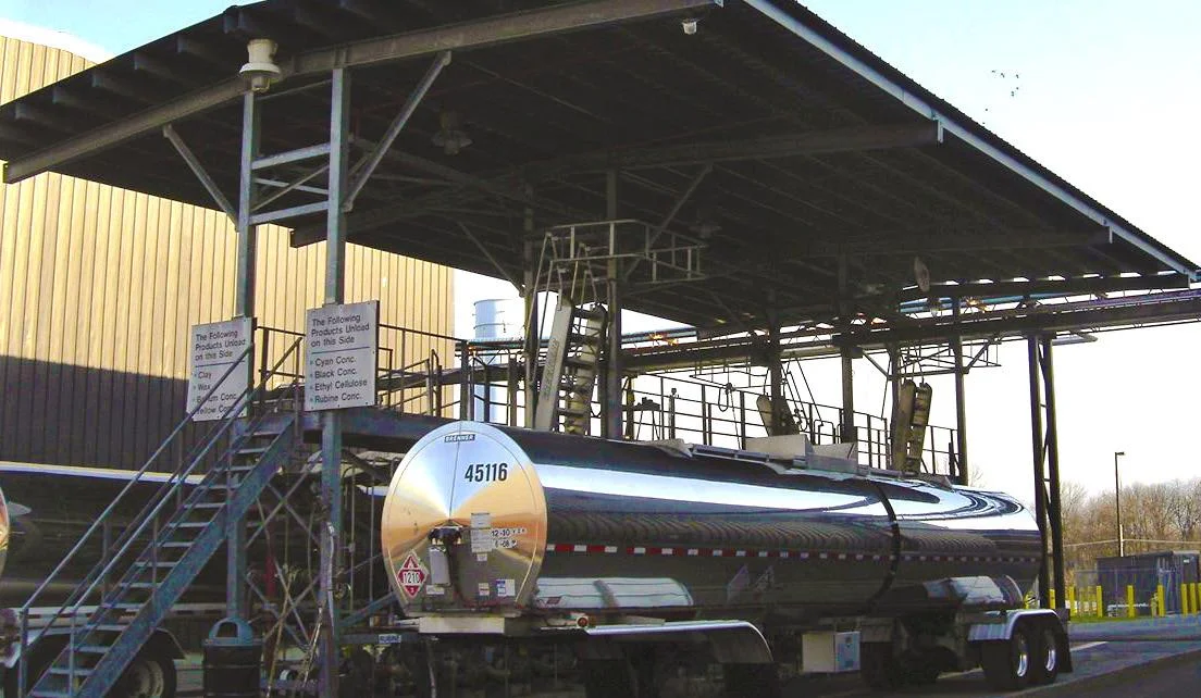
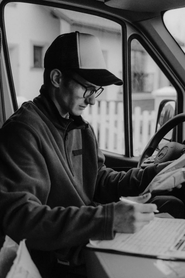
Small fuel carriers rely on printed bills of lading that move from the driver to the office before someone enters the figures into an invoice. Missing documents, transposed gallons and delayed paperwork interrupt that workflow. I framed the product around continuity: capture the document where the work happens, make it reviewable and keep it connected to the load.
WHAT I BUILT
One connected journey, two distinct working contexts.
I designed the driver tablet around the next physical task and the office desktop around review and operational follow through. The Scan tier supports document capture and filing; Haul connects documents to loads, dispatch, invoicing and driver pay. Shared patterns let the product expand without requiring a different interaction language.
rackrunner Scan
Capture and file documents. Every BOL photographed, read, and findable. No loads, no invoicing.
rackrunner Haul
The full operation: loads, dispatch, invoicing, and driver pay, with every document attached to the load it belongs to.
A DRIVER'S DAY
Eight screens from sign-in to day complete
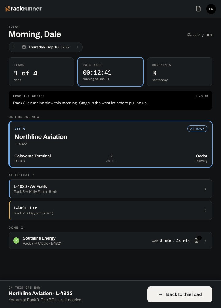
I used one primary action, large touch targets and concise instructions to support the driver’s context: a shared tablet, limited attention, gloves and changing light. The screens show how sign-in, arrival, capture and confirmation fit into the working day.
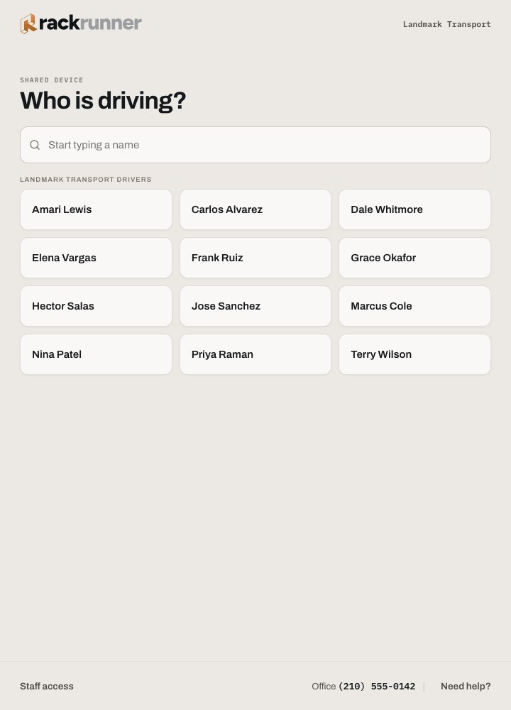
01
Who is driving
The shared tablet opens to a list of names. No usernames to remember.
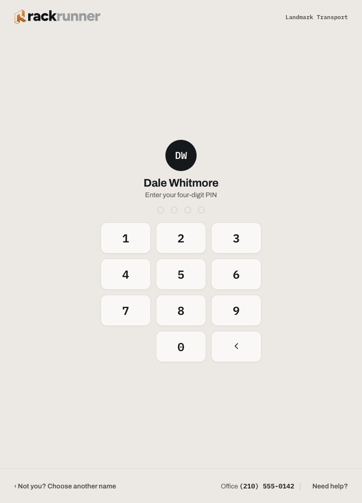
02
PIN
Four digits, set by the office, never displayed again.
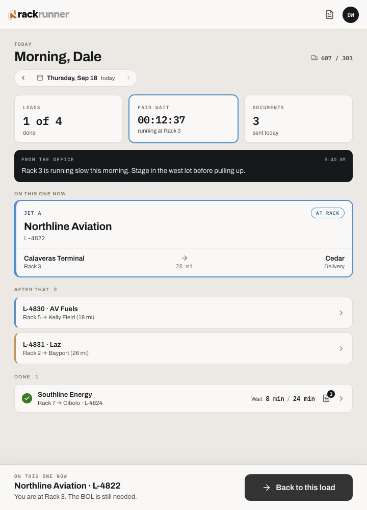
03
On a load
Today shows the current load and the next stop. One primary action.
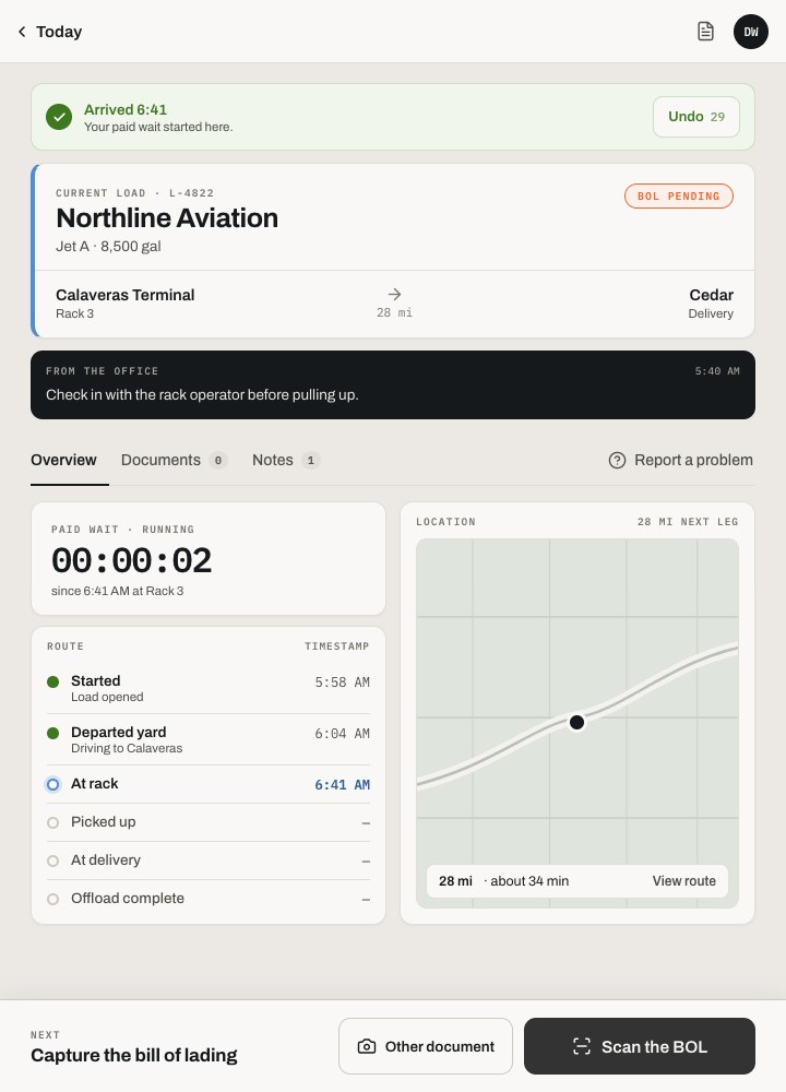
04
Just arrived
Arrival is stamped, and paid wait time starts on its own.
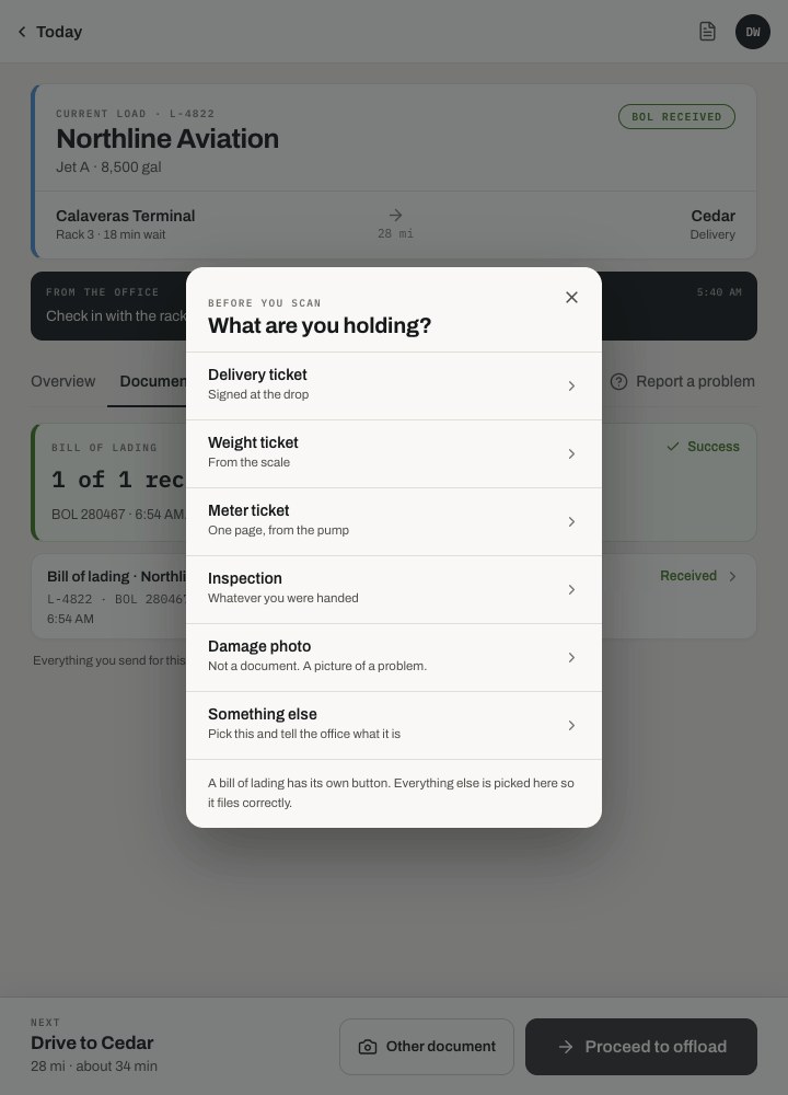
05
Pick a type
BOL, delivery ticket, or receipt. Three large targets for a gloved thumb.
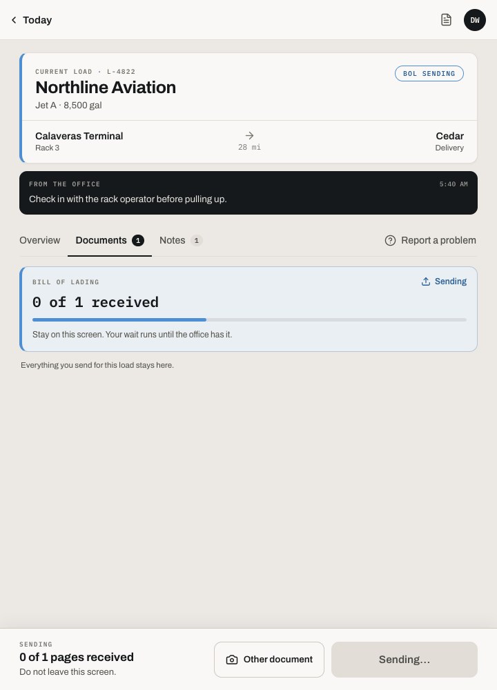
06
Sending
The driver can walk away. Sending finishes in the background.
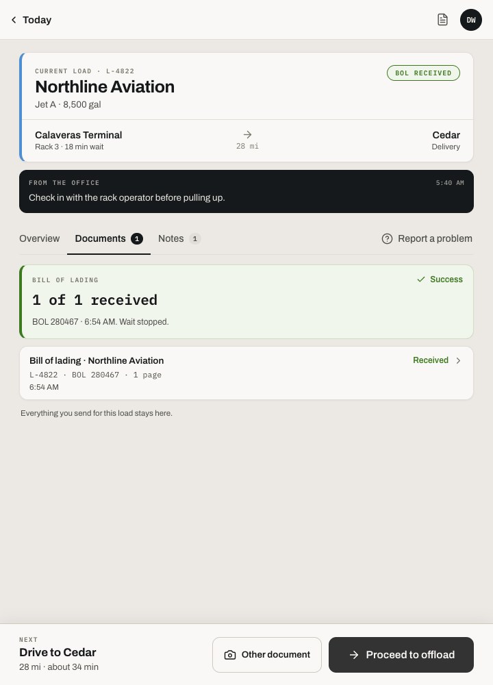
07
Received
The office has it. That is the only confirmation the driver needs.
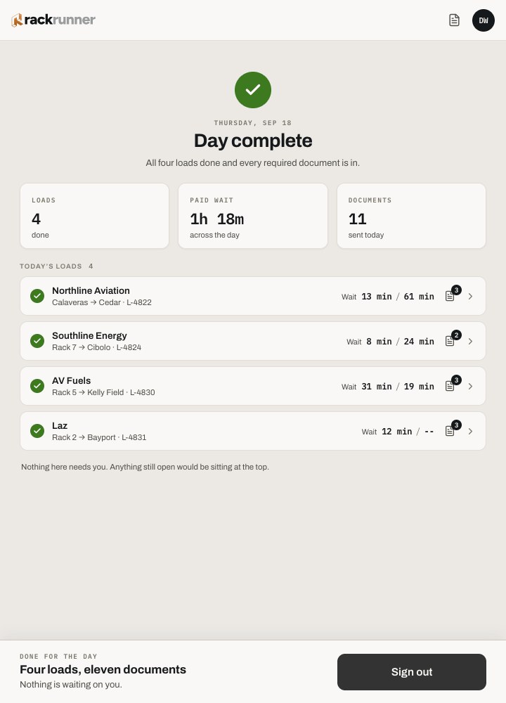
08
Day complete
A plain summary of the day, then the tablet is ready for the next driver.
THE CORE INTERACTION
Capture, review, file
I connected capture, review and filing so each person could see what required their attention. The driver needs to know the document was received; the office needs to verify uncertain fields and associate the document with the right load.
01 · CAPTURE
The driver photographs the BOL at the rack
Perspective is corrected on the device and the gallon figures are read before the truck leaves the yard. If the office still needs the BOL, the tablet says so plainly and waits.
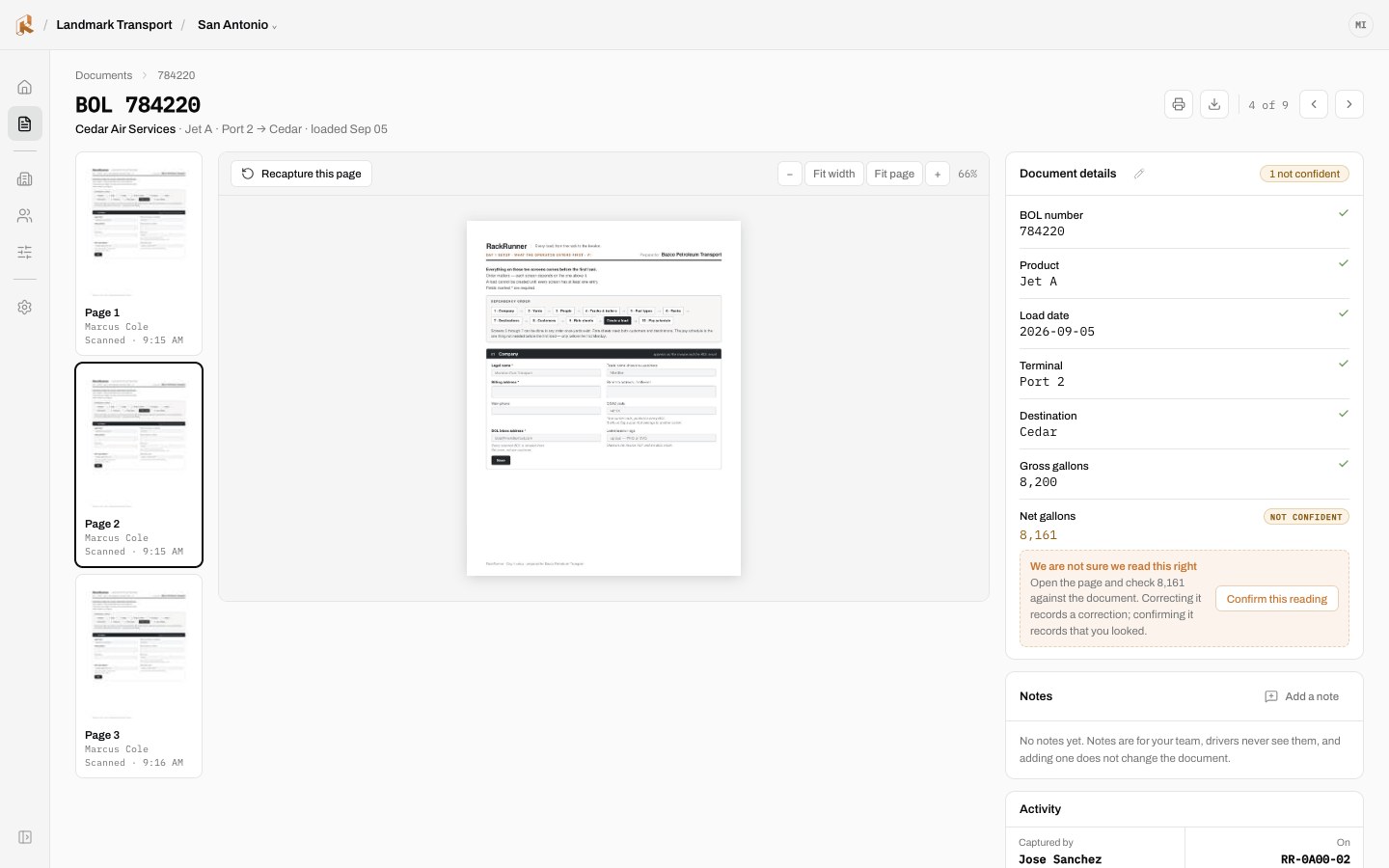
02 · REVIEW
The office sees a flagged field, not a failure
The scan read 8,161 and was not sure, so a person confirms it once. Copper tokens mark the things that need a human and everything the scan was sure of stays quiet.
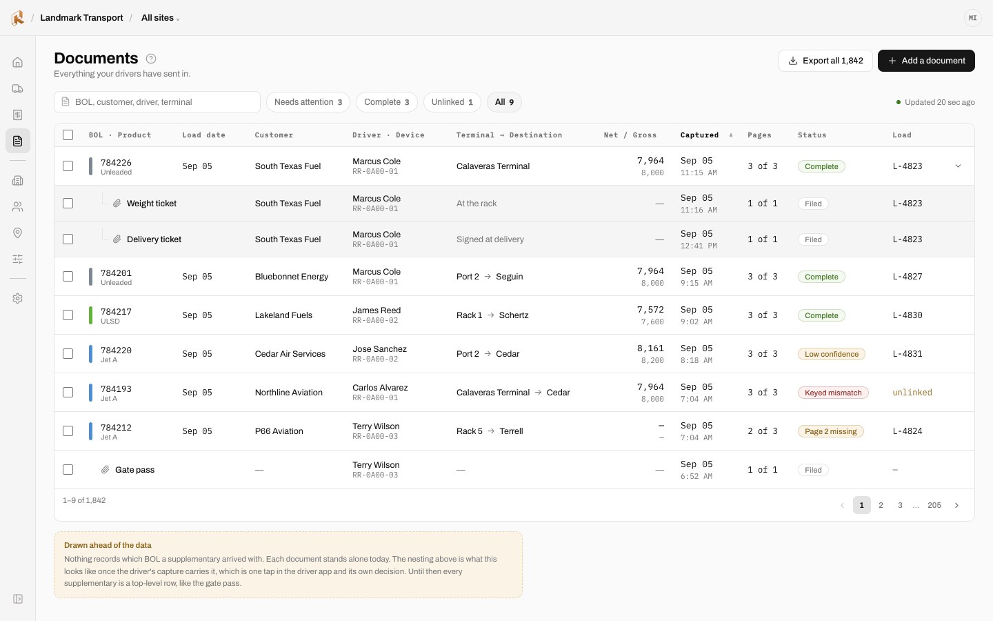
03 · FILE
The document lands on its load, ready to bill
In Haul, a confirmed document attaches to the load it belongs to, so invoicing starts from a document nobody retyped. In Scan, it is filed and findable.
DESIGNING FOR FAILURE
Make recovery part of the primary experience.
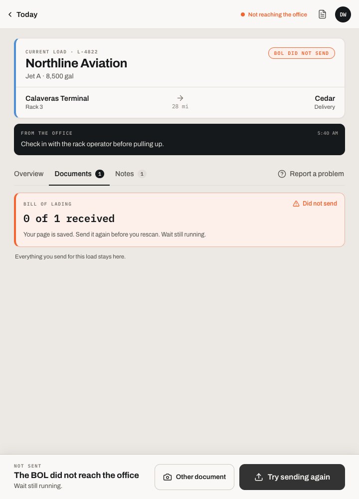
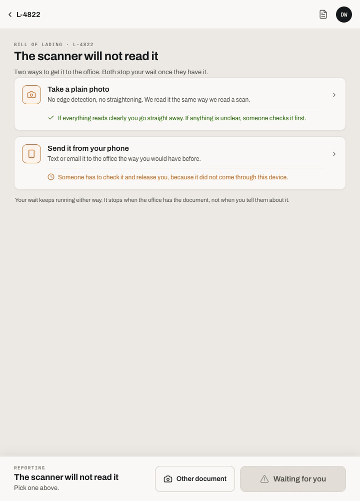
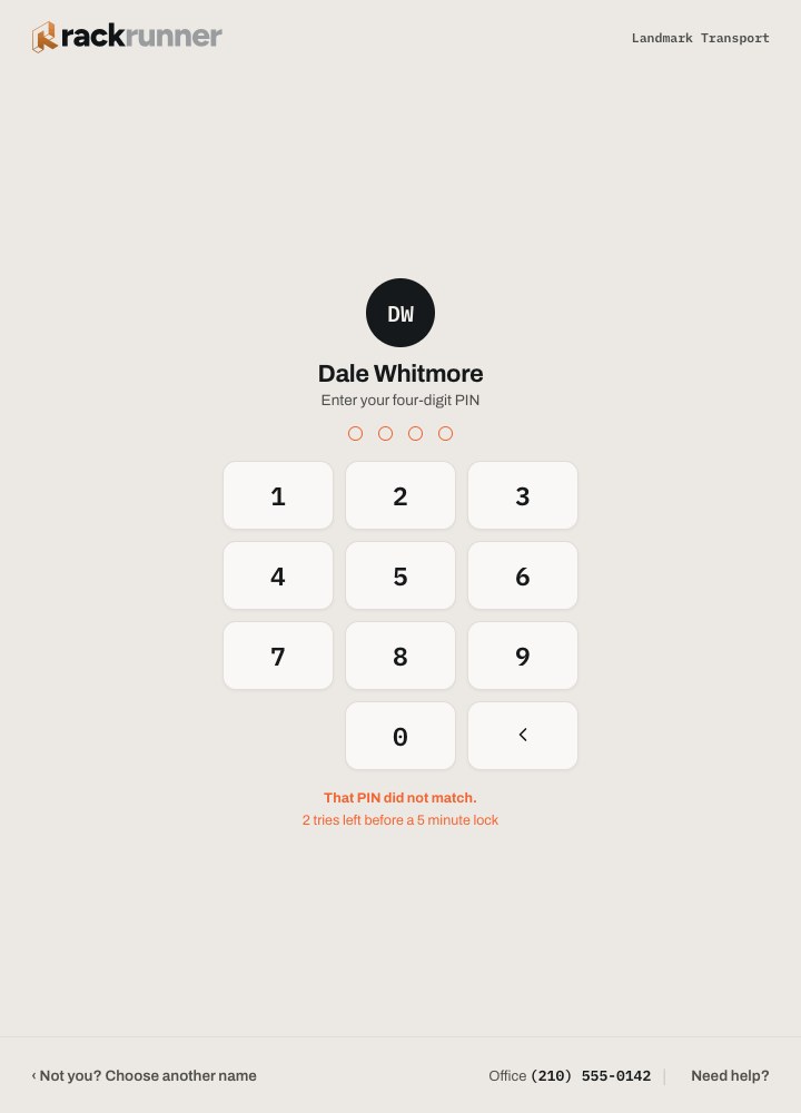
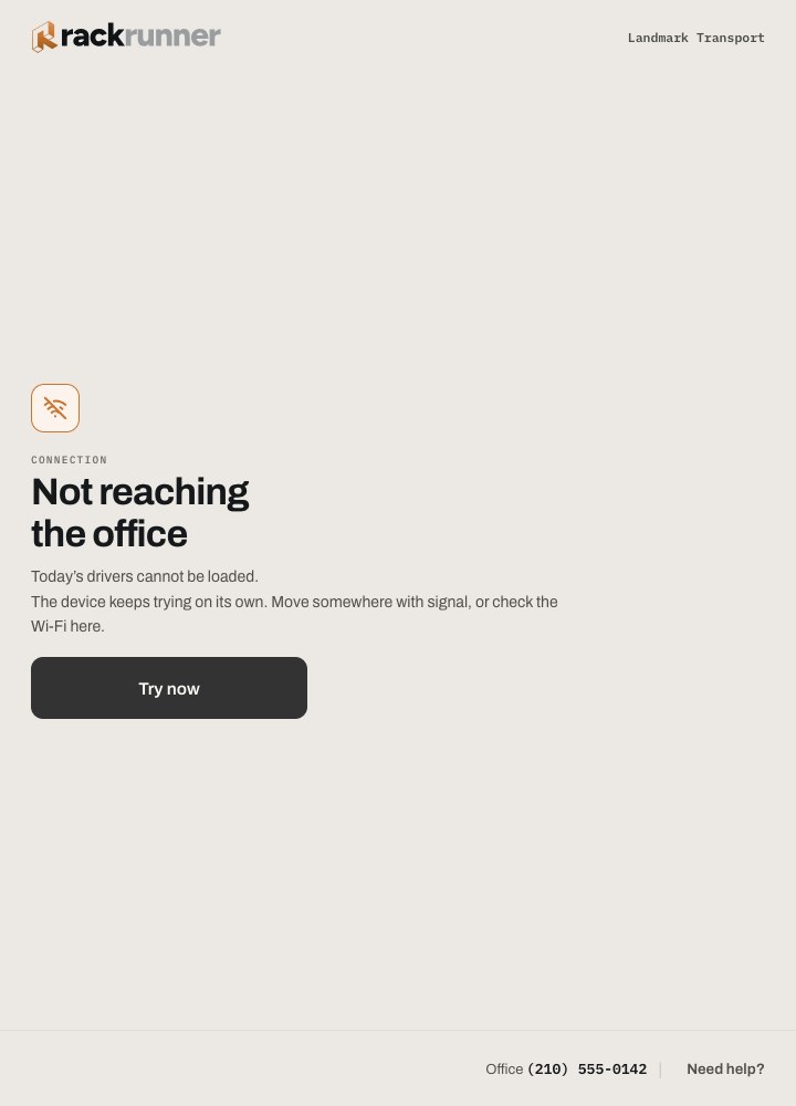
I specified recovery states alongside the normal flow, including failed uploads, unreadable documents, incorrect PINs and unavailable connectivity. Each state explains the problem and the next action. The design goal is to keep routine interruptions from becoming a dead end.
01
Did not send
The tablet keeps the document and says what to do next, instead of showing an error code.
02
Cannot scan
A torn or wet BOL has a way through: photograph it and let the office read it.
03
Wrong PIN
Plain language, a visible count of tries left, and a path to the office.
04
No signal
Yards have dead spots. Sign-in explains the wait and keeps trying.
LIGHT AND DARK
Paper and Night, named for where they get used
I designed Paper and Night for different lighting contexts at the rack and in the cab. Both use the same tokens and interaction rules, including the copper cue for an action that needs a person. The shared system keeps meaning consistent as the visual treatment changes.
PAPER · DRIVER
NIGHT · DRIVER
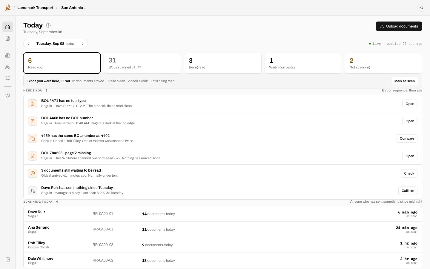
PAPER · OFFICE
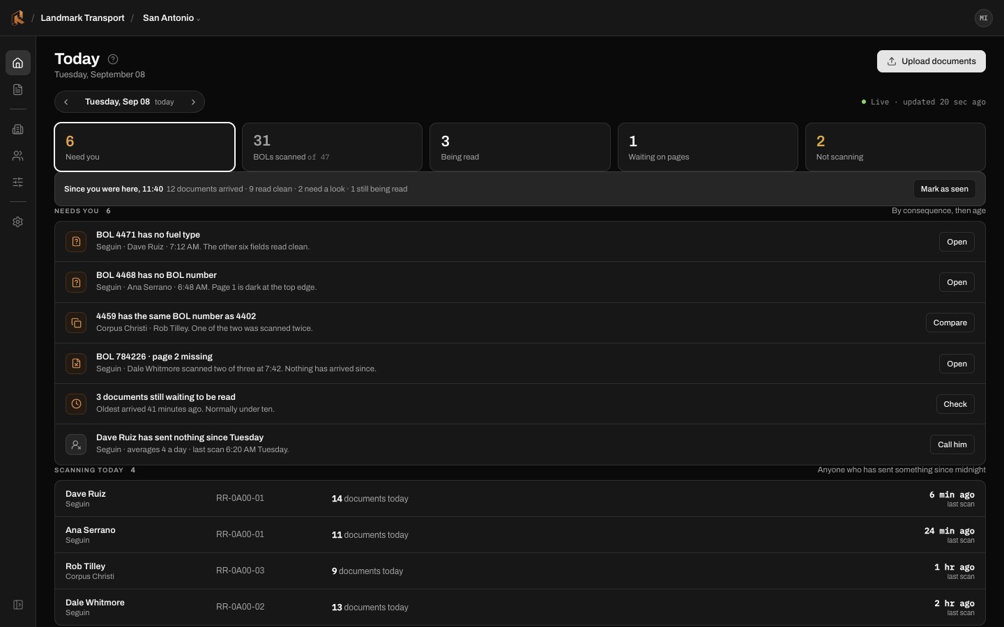
NIGHT · OFFICE
THE OFFICE
Organize the office around decisions and next actions.
I organized Today around what needs attention, with separate areas for operational work and setup. Roles scoped to each site, management of shared devices and instructive empty states make the interface usable across different responsibilities and stages of adoption.
TODAY · A WORKING MORNING
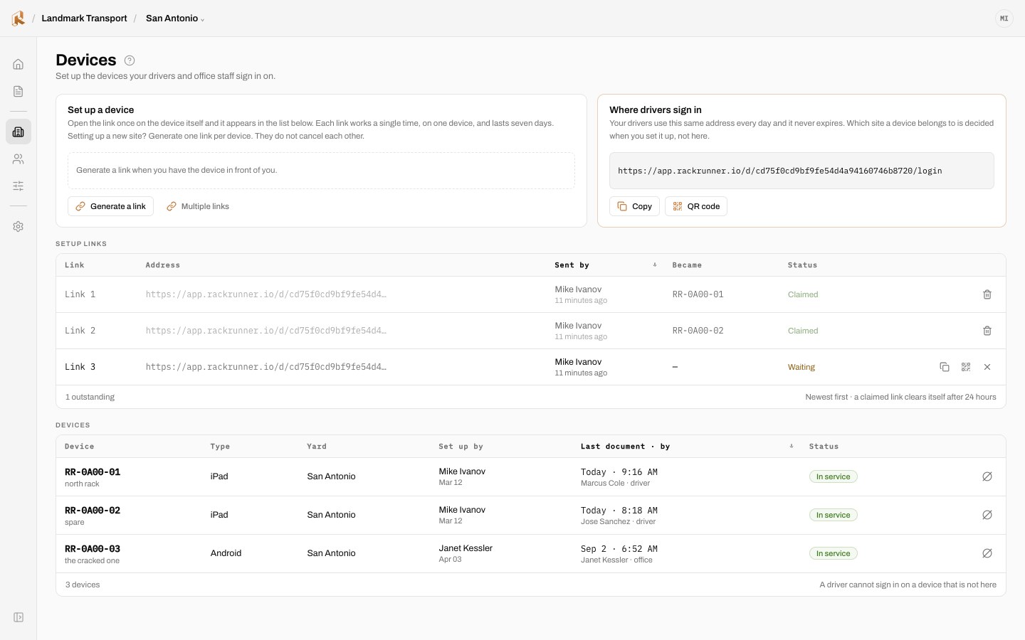
DEVICES
Tablets are assets, not accounts
Each yard tablet is linked, put in service, or taken out. Drivers never own one.
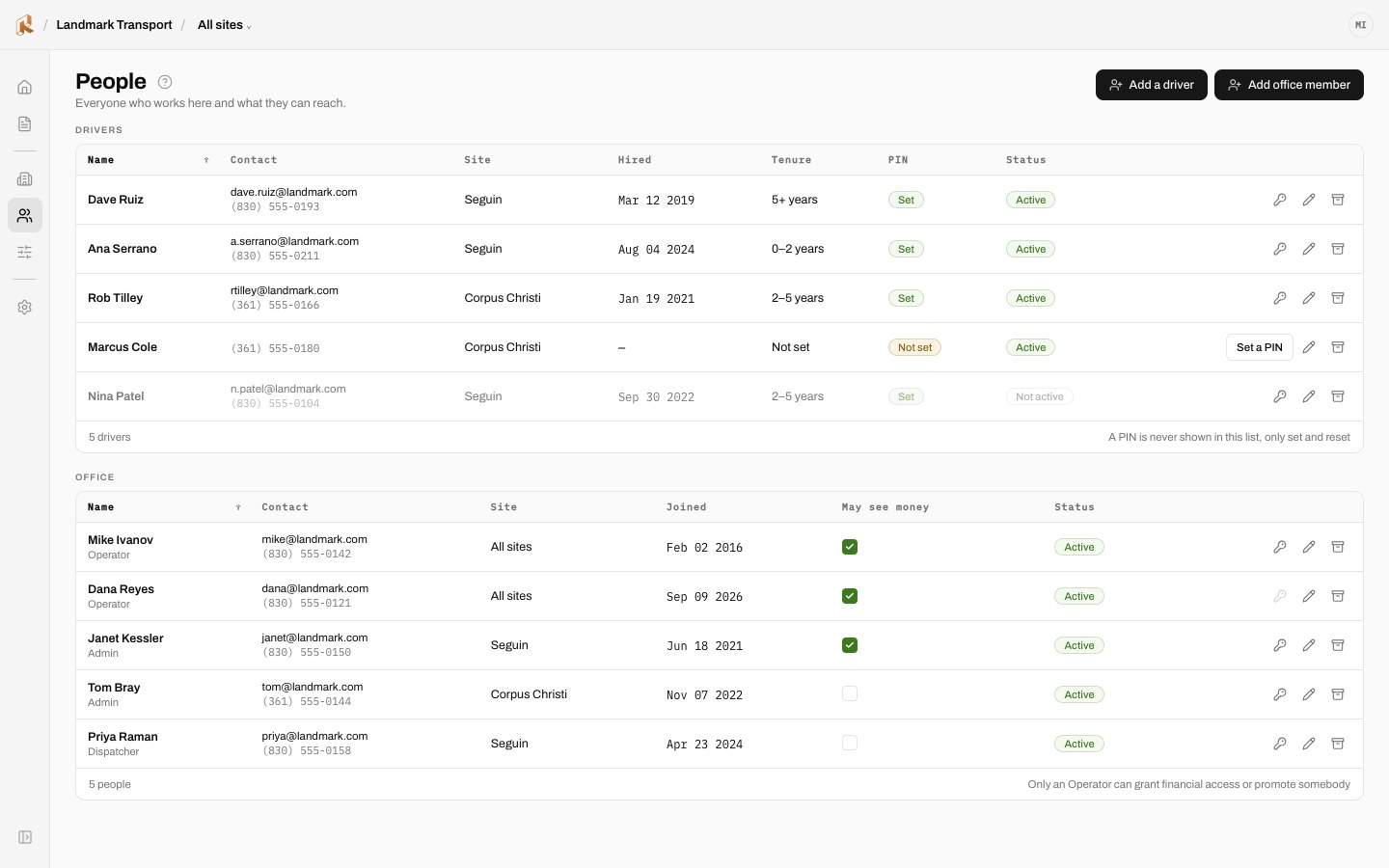
PEOPLE
Roles scoped to sites
Operators see the sites they run. Drivers get a name and a PIN.
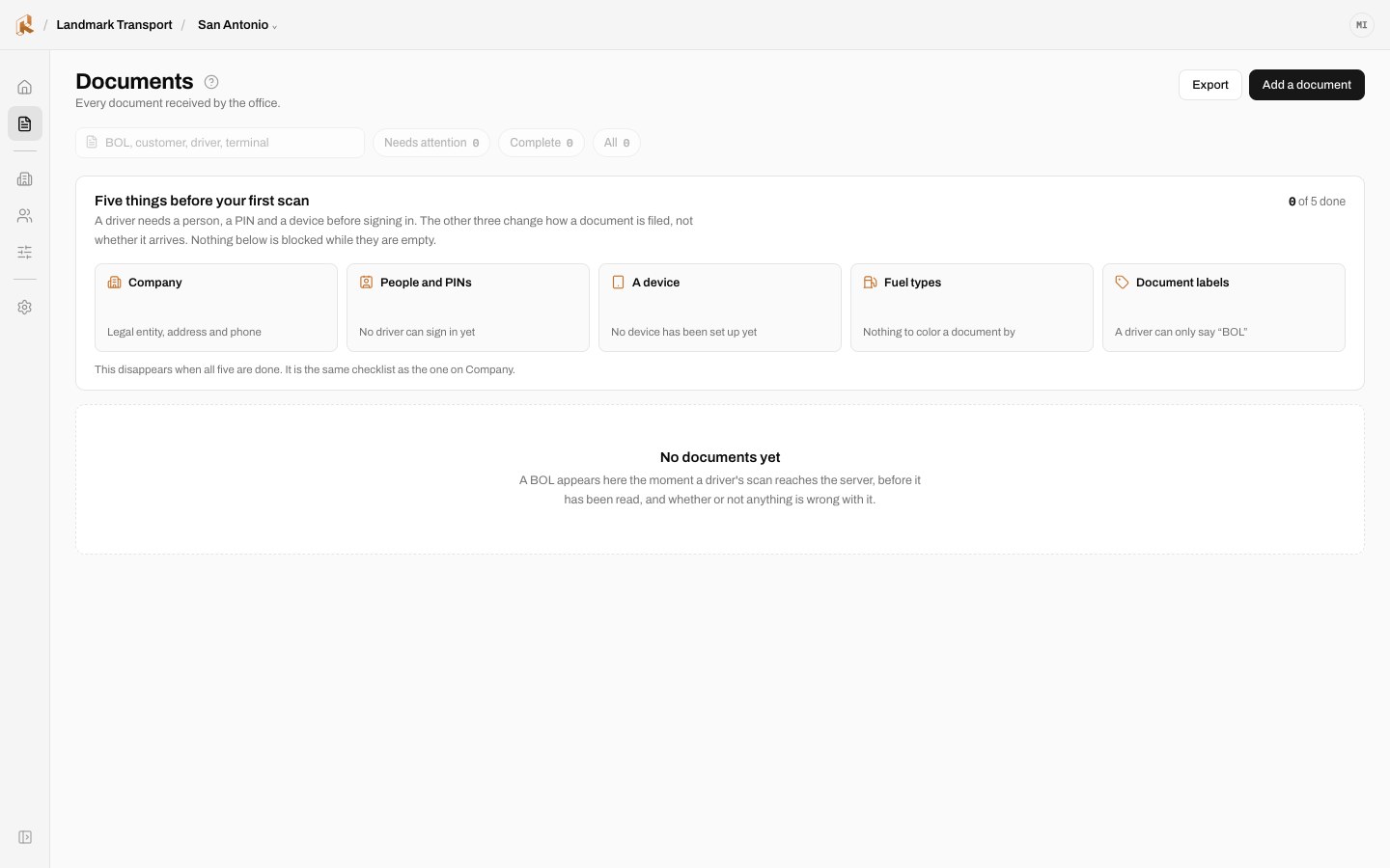
DAY ONE
Empty states that teach
A new carrier sees what will appear here and the one step that makes it appear.
A SYSTEM, NOT A SET OF SCREENS
Use shared rules to connect driver and office.
I established a common typography, token and feedback system across both surfaces. Consistent treatment of values produced by the system and actions requiring human review helps the two interfaces communicate the same workflow.
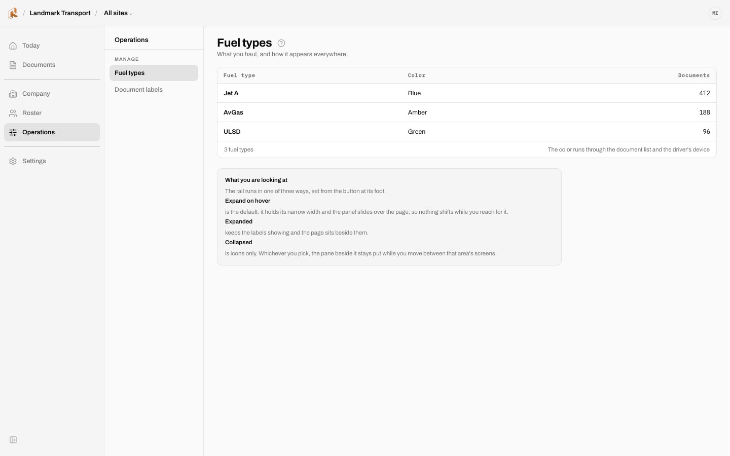
NAVIGATION · EXPANDED
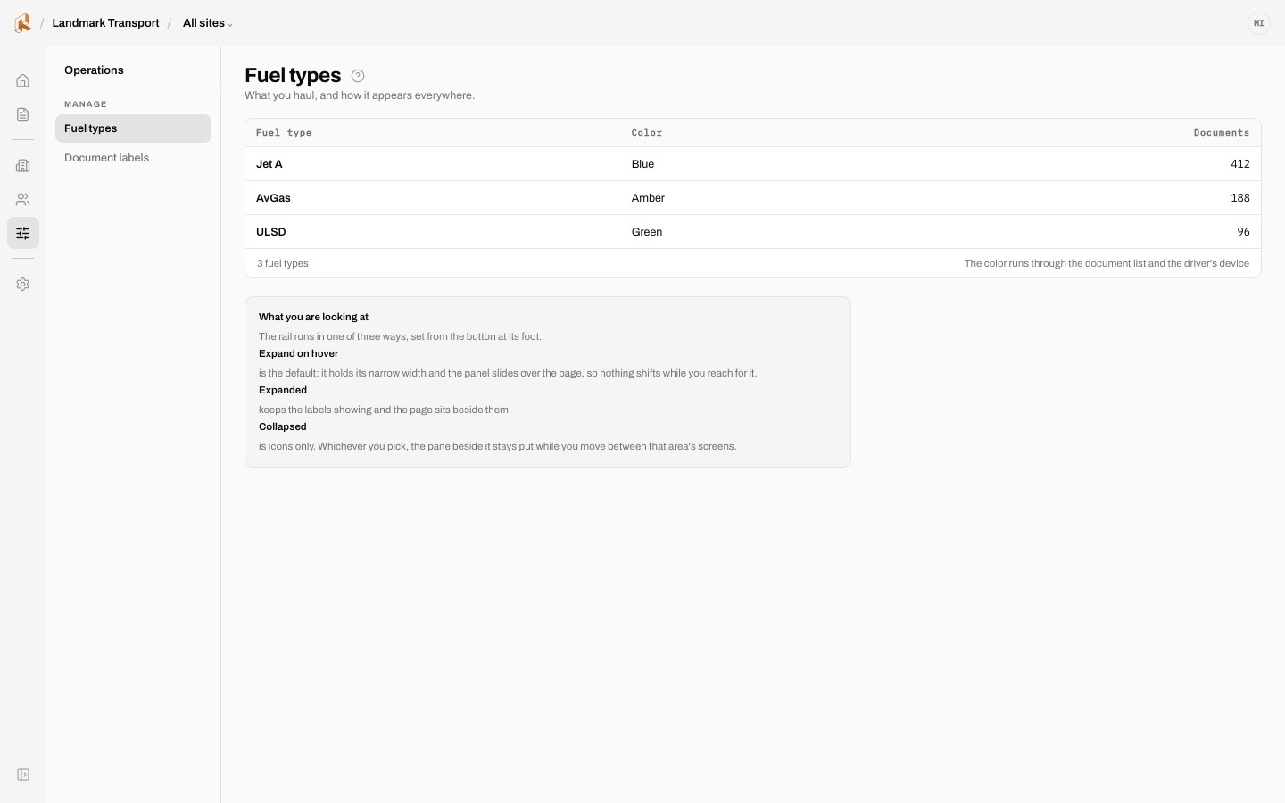
NAVIGATION · COLLAPSED
DESIGN DECISIONS
Five decisions that make the workflow understandable and accountable.
I balanced automation with user control, privacy and operational clarity. These decisions define what the interface communicates and where a person remains responsible.
01
Protect access on a shared device.
I used a name and PIN flow for the shared driver tablet. The office can set or reset a PIN but cannot retrieve it later. This keeps recovery available without treating a shared device as a shared identity.
02
Explain the consequence and the next action.
I used concrete language for uncertain scans and incomplete invoices, showing what needs a review and why. The interface explains the effect on the work rather than asking people to interpret an internal status label.
03
Make permissions visible without misleading totals.
For administrators scoped to a site, I showed site names without counts that could be mistaken for totals across the organization. The tradeoff favors an accurate view over a more populated dashboard.
04
Keep financial approval with a person.
I designed automation to support reading, filing and invoice assembly. A person still approves the invoice, and that approval is recorded. The workflow makes the boundary between assistance and a financial decision explicit.
05
Report document outcomes, not driver activity.
I designed the office view to show whether a document arrived, rather than stream the tablet’s activity. This gives operators the information they need without expanding the product into driver surveillance.

The design goal is a clear path from captured document to reviewed work. The pilot is the next test of how well that path supports real operations.
C.Price
MBA·PMP
UX/UI Design · Design Systems · Accessibility
© 2026 C.Price
Atlanta, GA (metro)