C.Price MBA·PMP Available Work Process
USAA UX case study · Financial services

When money goes missing, the experience has to earn trust back.

I designed clearer ways for members to report transaction disputes, understand what happens next and follow case progress. The work connected interaction design, shared patterns and implementation quality around a moment that mattered to their financial confidence.
35%
fewer dispute calls, YoY
42%
faster to complete a dispute
$1.2M
projected 3-year savings
ROLE
Senior Product Designer
DURATION
11/2021 – 01/2026
SCOPE
Interaction design · Design systems · Design QA
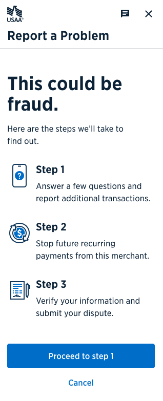
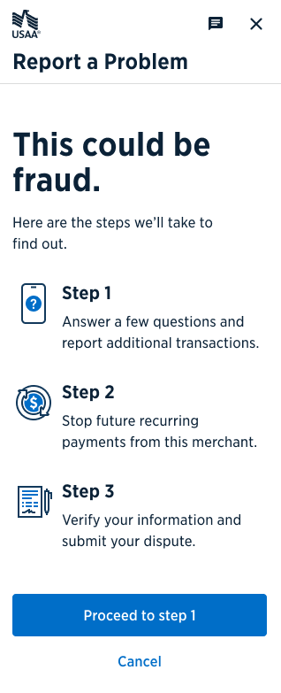
Report a problem: This could be fraud, three-step overview
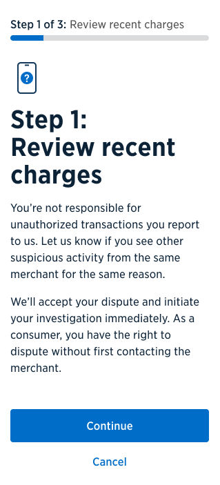
Step 1 of 3: Review recent charges
✓ Step 1 of 3+72% CLARITY & CONFIDENCE
CORRECT PATH 86%
MANDATE
Modernize the dispute experience and QA platforms while integrating enterprise systems mid-flight.
BASELINE
An outdated dispute flow driving call volume, misreported dispute types, and elevated defect rates.
MY RESPONSIBILITY
Research, journey mapping, interaction design, prototypes, reusable dispute patterns and design QA, in partnership with product, engineering, research, legal and compliance.
PRINCIPAL CONSTRAINT
Every change passed legal, compliance, and legacy system review, so clarity had to survive regulation.
RESULT
86% correct path selection in the usability test; internally reported call reductions. Status tracking savings remain a projection and the separate design quality case covers Foundation Review defects.
The context

Help members navigate uncertainty, from intake to resolution.

A disputed charge can leave a member anxious about their money and unsure what to do. The challenge was to make reporting and follow up understandable across debit, credit and ACH scenarios, while working within legal, compliance and legacy system constraints. I worked with research, product and engineering to connect clear entry choices, guidance, confirmation and visible status into a coherent experience.
The operating constraints
Regulation. Dispute flows are governed language, with required consultations with legal and compliance.
Legacy systems. Enterprise integration and transition ran concurrently with the redesign.
Organizational complexity. Multiple teams across disciplines, one backlog, competing priorities.
Confidentiality. Artifacts shown here are sanitized; metrics are as reported internally.

CDO theme · Moments that Matter

Design for the whole dispute, not just the submission.

A transaction problem can affect a member’s financial confidence as well as their account balance. The Digital Disputes Intake & Tracker program connected reporting, confirmation and ongoing status into one journey. My design work addressed the decisions, instructions and feedback members needed along that path.

Clarity of purpose

Help members understand the dispute process, what to do next and what a status update means.

Comfortable experiences

Reduce complexity during a stressful task through clear choices, useful guidance and consistent interactions.

Confident satisfaction

Confirm that the request was received and keep the member informed while the case moves toward resolution.
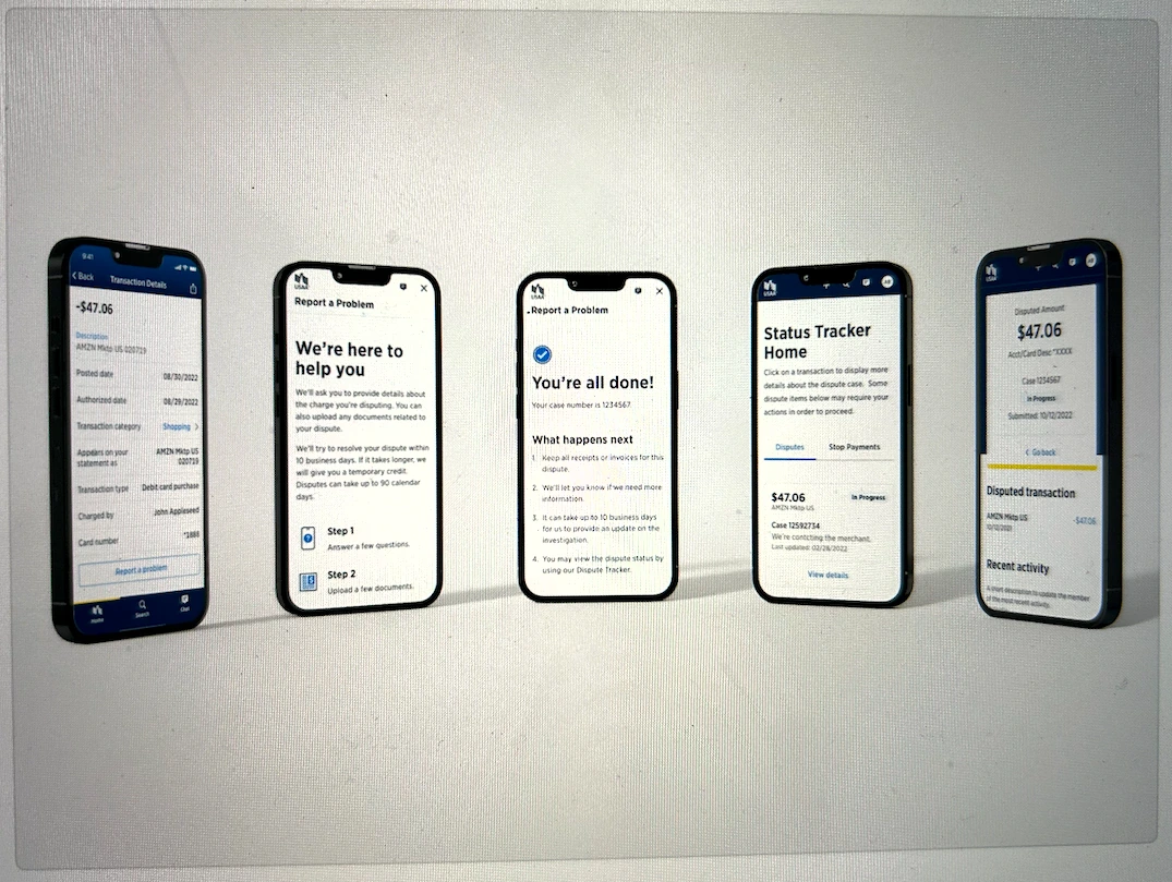
Five original dispute journey screens: transaction detail, intake guidance, submission confirmation, tracker home and case detail.
  1. 01 · Find the transaction

    Start from the charge the member wants to question.

  2. 02 · Understand the steps

    Explain the information needed and the tasks ahead.

  3. 03 · Confirm submission

    Provide a case number and explain what happens next.

  4. 04 · Follow case status

    Make active disputes and required actions visible.

  5. 05 · Review case details

    Connect status, transaction information and recent activity.

Program objective

Reduce dispute call volume by 30%.

The program presentation set a three year target of 3.2 million fewer calls and $31M in call costs, alongside addressing member complaints.

Intended member outcome

Submit and track digitally, with support when needed.

Enable members to submit fraud and non-fraud disputes and check their status without needing to call for routine updates. The program also aimed to give Member Service Representatives access to the same modern experience when members needed help.
What I saw

The data said members weren't confused by disputes. They were confused by us.

86%
of members chose the right reporting path once entry options were made explicit. The original flow forced one ambiguous door.
72%
increase in measured clarity and confidence with guidance before each action. Empathy mapping showed frustrated members encountering legal language mid-task.
Defects
Defect analysis clustered failures around a handful of flows, which meant QA effort could be prioritized by data instead of spread evenly. That finding changed the direction.
The goal

Clarity, comfort and confidence across the journey

The CDO theme “Moments that Matter” gave the program a clear experience direction: help members understand the process, feel at ease using it and know their needs are being addressed. I carried that direction into the choices, instructions and feedback within the dispute flow.
Comfort
Clarity
Confidence
This could be fraud: three-step intake overview
01 · First things first

Four clear doors instead of one ambiguous one

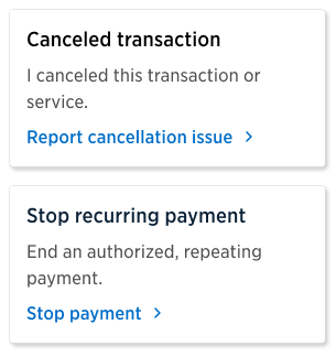
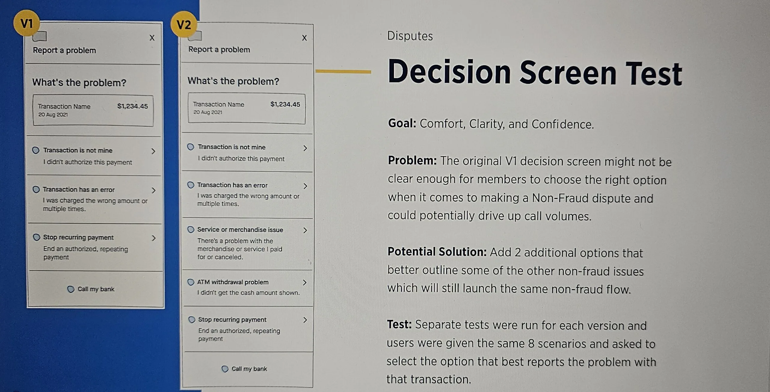
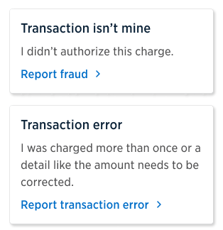
The original decision tree offered two options: “I did business with this merchant but want to report a problem” and “I did NOT do business with this merchant.” Neither matched how members actually think about a bad charge, so reports were miscategorized and members called support instead.
Presenting explicit, options written in plain language let members route themselves to the right reporting path.
86%of members chose the correct reporting path
Decision options: transaction isn’t mine, transaction error
Decision options: canceled transaction, stop recurring payment
Decision screen test: V1 versus V2
02 · Clear instructions at every step

Tell members what will happen before asking them to act

Empathy mapping showed members arriving frustrated and unsure what they were doing. The original flow presented every instruction at the start at once, raising cognitive load in an already stressful situation.
Each step now states what the member is about to do and why. Legal language stays, but it sits where it informs rather than interrupts.
+72%in measured clarity and confidence completing a dispute
Report a problem: three-step overview
Step 1 of 3: Review recent charges
03 · Setting expectations

Close the loop, so members don’t call to ask

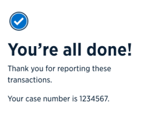
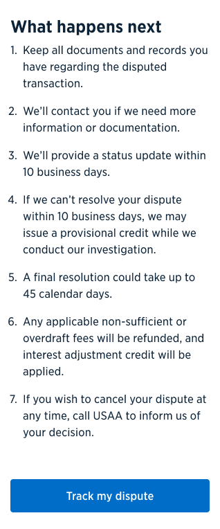
After submitting a dispute, members were returned to their account home with no confirmation and no next steps, so they called the service center to check that it went through.
A success screen gives members a sense of completion; a numbered “what happens next” sets timelines, rules for provisional credit, and how to cancel. Clear expectations on next steps and timing drove the reduction in calls.
35%reduction in calls about disputes compared with the previous year
You’re all done: case number confirmation
What happens next: seven numbered expectations
04 · Status tracking

A dispute members can see moving

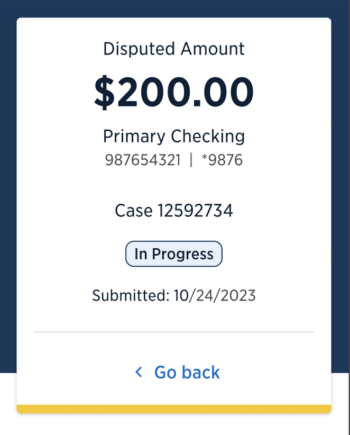
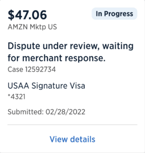
Status tracking required more than a new screen. I partnered with engineering on the API triggers needed to make case progress visible after submission, connecting interface decisions to the systems that supported them.
The tracker brought status, required actions and recent activity into the experience. The original program framing also considered continuity with Member Service Representatives when a member needed human support.
$1.2Mprojected savings over 3 years from reduced status calls
Disputed amount case detail: in progress
Dispute under review: waiting for merchant response
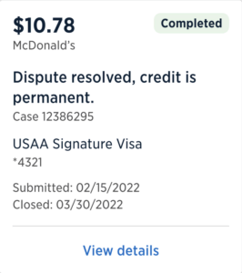
Dispute resolved: credit is permanent
The consequential decisions

Four decisions I owned.

01
Provide guidance at the point of action.
Explain what happens next before asking the member to act. Keep required legal language where it informs the current decision.
Finding
Members arrived frustrated; presenting every instruction at once added cognitive load.
Tradeoff
Distribute guidance across the journey while retaining the required legal content.
Evidence
Internally reported measures showed a 72% increase in clarity and confidence.
02
Make the entry paths explicit.
Make four reporting paths explicit in language members can recognize.
Finding
The original merchant-based choice did not match how members described a bad charge.
Tradeoff
Show more entry options to reduce ambiguity before a member starts the wrong flow.
Evidence
86% correct path selection in usability testing.
03
Partner with IT on status tracking.
Partner with engineering on API triggers that support visible case progress after submission.
Finding
Members could not see what happened after submission and called to check progress.
Tradeoff
A status interface required infrastructure changes as well as screen design.
Evidence
$1.2M in projected savings over three years from reduced status calls.
04
Use recurring defects to improve design quality.
Focus design QA and reusable patterns on the flows where defects clustered. Define expected behavior and alternative scenarios before handoff.
Finding
A small set of flows accounted for recurring defects.
Tradeoff
Concentrate review effort on demonstrated problems rather than review every flow with equal intensity.
Evidence
My team reduced Foundation Review defects 50% within six months of the new QA strategy. The separate design quality case explains the pilot and organization wide adoption.

Exploration · Review · Measurement

The working evidence behind the experience.

These artifacts show the progression from earlier status concepts to more structured summaries and case details, alongside design feedback and analytics used to understand the wider journey.
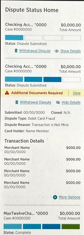
Earlier dispute status screen with segmented progress indicators, expandable details and a document request.

Earlier status concept

An earlier approach combined progress bars, transaction detail and document requests in a long view.
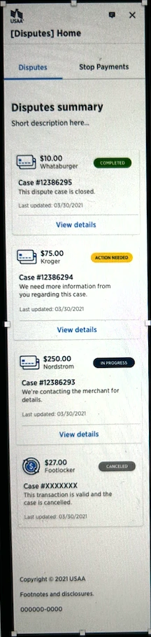
Dispute summary exploration showing separate cases with Completed, Action Needed, In Progress and Canceled badges.

Summary and status exploration

Case cards explored clearer grouping and text status labels, including when a member needed to act.
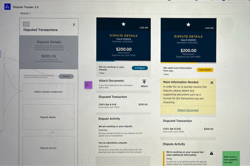
Tracker design file with a wireframe beside In Progress and Action Needed case-detail explorations.

From structure to detailed states

Wireframes and detailed states explored how status, supporting documents and activity fit together.
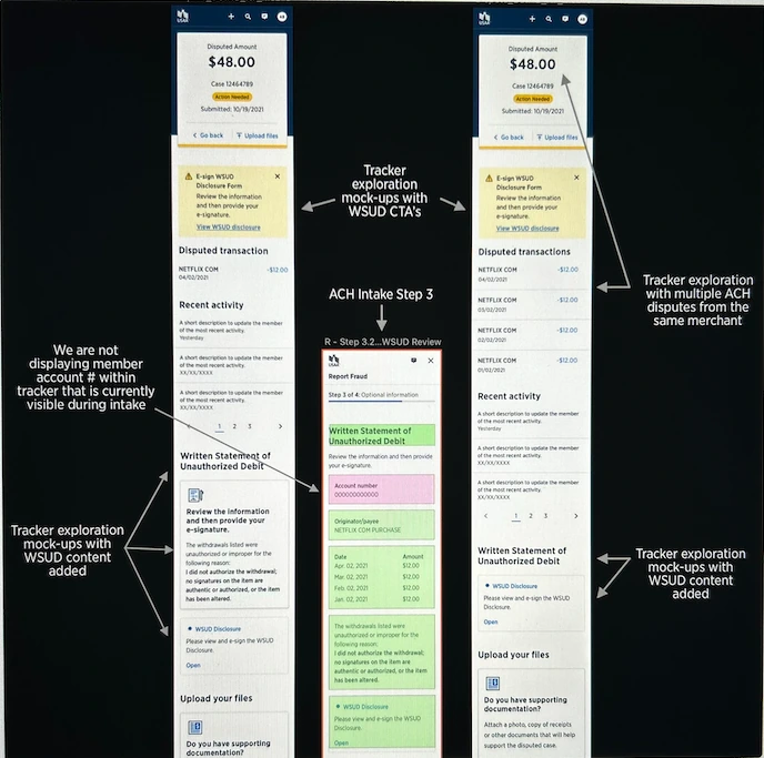
Annotated ACH intake and tracker screens with written-statement disclosures, document upload and arrows describing design feedback.

ACH intake and tracker review

Annotations connected intake disclosures, supporting documents and tracker content across related screens.
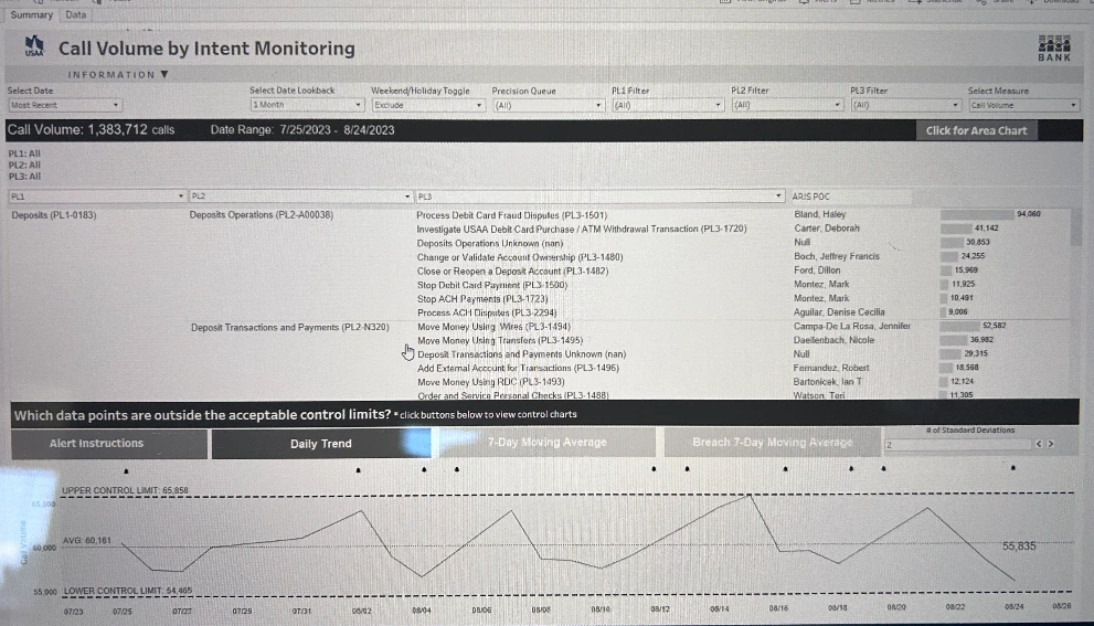
Call Volume by Intent Monitoring dashboard with service categories and a daily trend chart.

Call volume by intent

Reporting by intent provided operational context for where digital experiences and member support intersected.
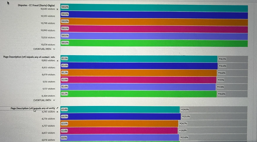
Digital dispute analytics showing visit counts and progression through contact-information and verification pages.

Digital journey analytics

Progression through individual pages provided evidence for examining where members continued or left the intake journey.

The connection matters: understandable interfaces depend on consistent patterns, reliable status information and a path to human support. Measurement helps teams decide where an improvement will make a meaningful difference.
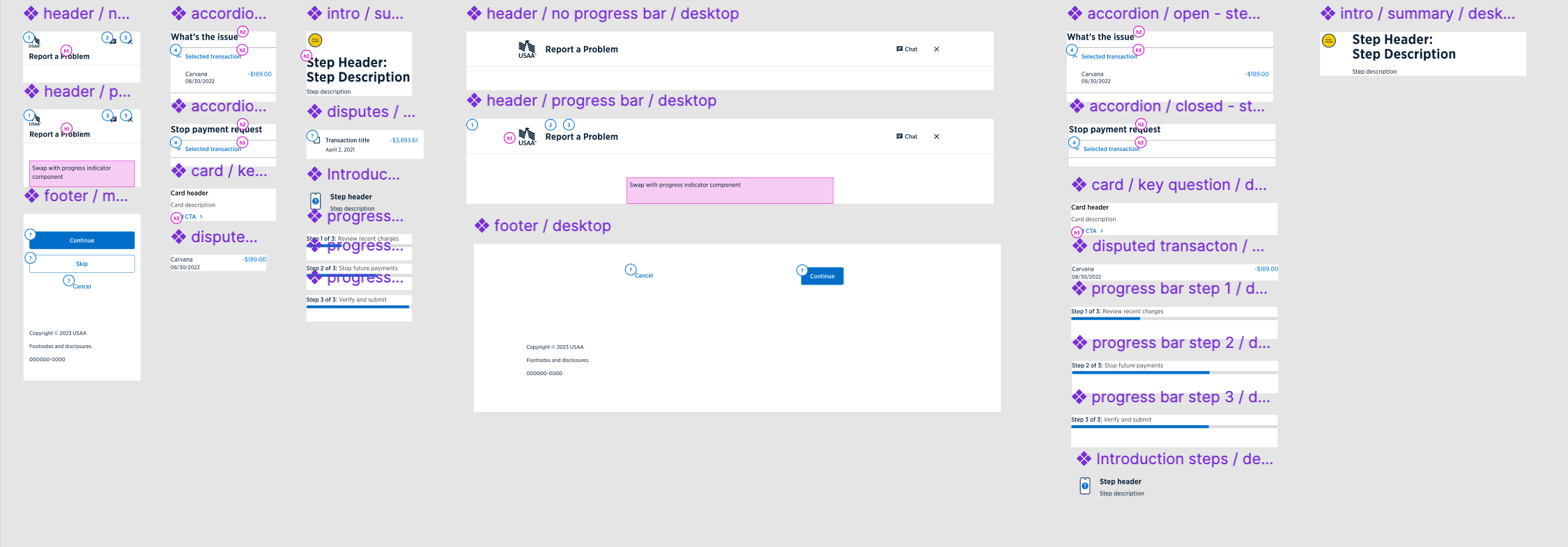
The process

Research, interaction design and implementation quality.

Design system component additions
DESIGN SYSTEM ADDITIONS
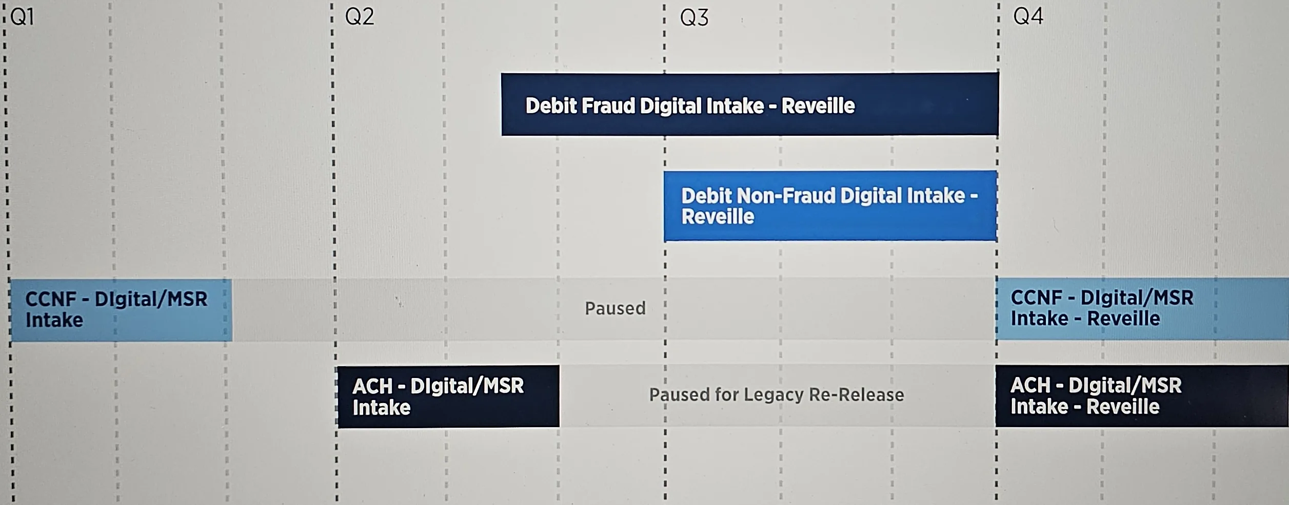
Disputes intake roadmap Q1–Q4
ROADMAP · PHASED INTAKE DELIVERY
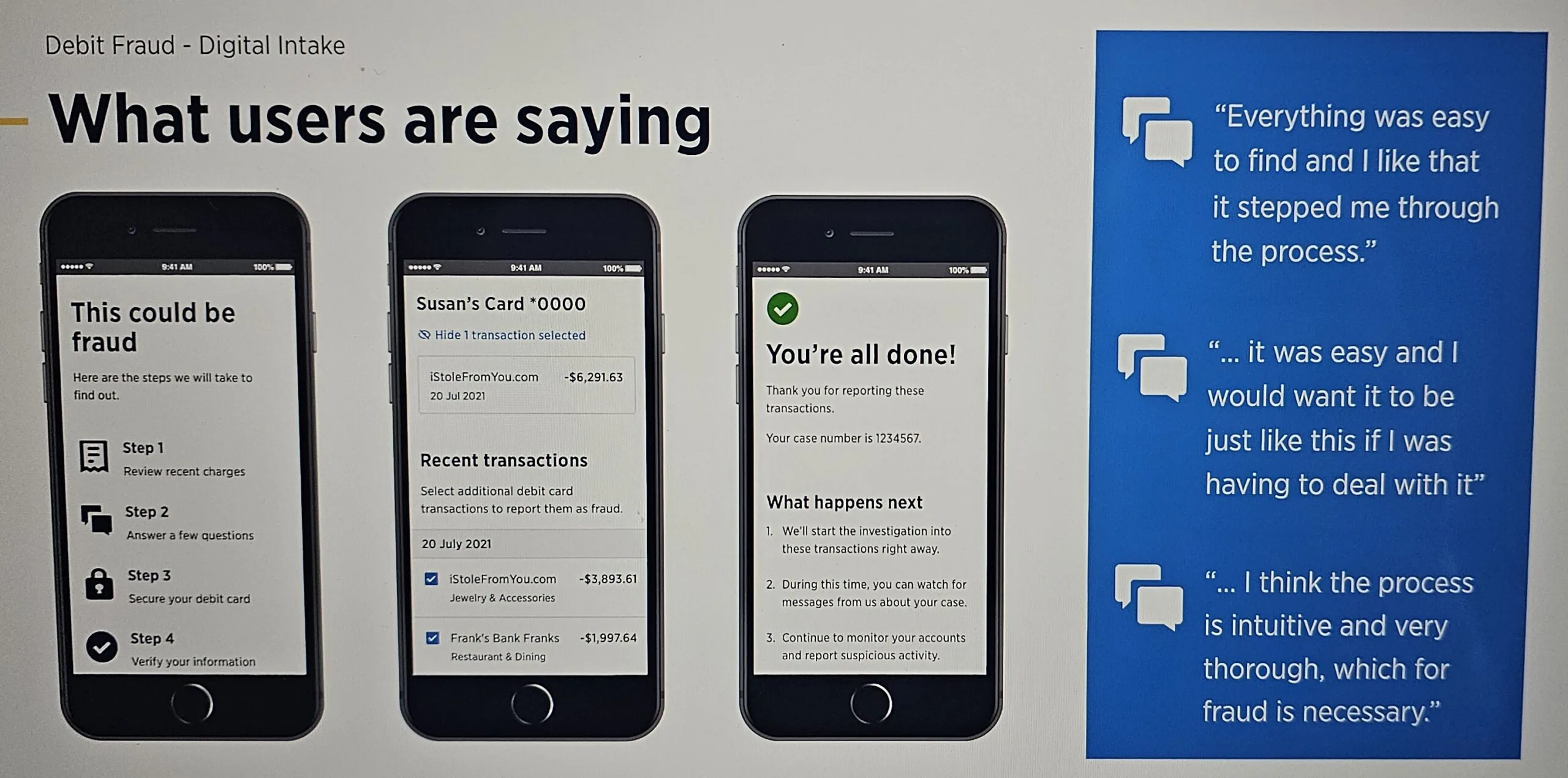
User research: what users are saying
USER RESEARCH · DEBIT FRAUD INTAKE
Research & discovery
A discovery phase combining quantitative signals, qualitative insights, and internal expertise to map pain points and opportunities.
Journey mapping
Journey through the existing experience and empathy maps from real scenarios exposed pain points, emotional friction, and where calls were being created.
Design centered on people
Workshops with stakeholders to align business, legal, and member needs across multiple teams.
Early wireframes & validation
Rapid early concepts tested with users, measuring task completion time and comprehension before committing to high fidelity.
Stakeholder & legal alignment
Stakeholder and legal support secured by pairing research insight with design rationale aligned with compliance requirements.
Detailed design & prototypes
Interactive mobile prototypes validated for usability, accessibility, and brand consistency.
Design system maturity
Reusable dispute components contributed to the enterprise design system for faster, consistent delivery across channels.
Implementation support
Supported phased implementation of debit fraud, debit non-fraud, CCNF and ACH experiences with engineering and product.
TOOLSFigmaFigJamMuralMazeUserZoomZoomSlackBoxKeynote / PowerPoint
What changed
Experience
Mobile-first dispute paths, guidance before each action, confirmation and visible case progress.
Systems
Reusable dispute components contributed to the enterprise design system.
Design quality
Recurring defect patterns informed design QA, expected behavior and implementation review.
Collaboration
Research, product, engineering, legal and compliance aligned on the intended member experience.
Design leadership & accessibility
Appointed my team’s QA Advocate, I brought accessibility and design-system expertise into recurring reviews and implementation support. I piloted a revised QA strategy within my team, then presented the findings to QA and Design System directors and stakeholders to secure broader adoption.
Reflection
Guidance belongs at the point of action. Defect data helped focus design review, and the status tracker showed why engineering constraints belong in discovery. I would bring engineering into that conversation earlier.
Next case study: USAA →
C.Price MBA·PMP
UX/UI Design · Design Systems · Accessibility
Work Process Roles LinkedIn ↗
© 2026 C.Price Atlanta, GA (metro)